
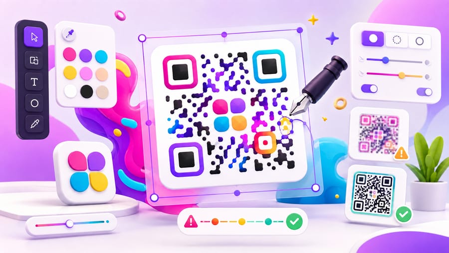
A plain black-and-white square works perfectly and looks like nothing. A heavily styled code matches your brand and sometimes does not scan at all. Everything interesting happens between those two, and the good news is that the rules are mechanical rather than mysterious: a scanner needs to find three corners, tell dark from light, and read every module. Stay inside those three requirements and you can brand a code quite hard.
Why a logo is possible at all
QR codes carry Reed–Solomon error correction — redundant data that lets a scanner reconstruct what it cannot see. There are four levels, and they define your entire design budget:
- L — recovers about 7% damage. Smallest, most fragile.
- M — about 15%. A good default for clean digital use.
- Q — about 25%.
- H — about 30%. The one that makes centre logos safe.
Level H is the default in Enqre for exactly this reason. It is not free: more redundancy means more modules, so an H code is visibly denser than an L code carrying the same data. That density is the price of a logo and of surviving a scuffed label.
The logo
- Keep it around a quarter of the code's area or less. Enqre sizes an uploaded logo to about 25% with a clear margin punched around it, which sits comfortably inside what level H can rebuild. Scaling a logo up until it "looks right" is the single most common way people break their own code.
- Centre it. The middle is the safest region. The three corners are not negotiable — a logo touching a finder pattern kills the scan outright, no matter what the error correction level is.
- Give it a solid background. A transparent PNG with thin strokes sitting directly on the modules reads as noise. A small opaque plate behind the mark is both cleaner and safer.
- Simplify. At 2 cm printed, a wordmark with fine serifs is illegible mush. Use the icon, the monogram, or a single letter.
Colour
- Contrast is the whole game. Aim for a strong dark-on-light relationship; if you squint and the pattern goes flat, a phone camera in bad light will fail too. Mid-tone code on mid-tone background is the classic failure.
- Dark modules, light background. Inverting (light on dark) works on many modern phones and not on older ones. If the brand demands a dark look, put a light panel behind the code rather than inverting it.
- Avoid red and yellow modules. Cameras and older scanners see red as nearly light. Blues, greens, violets and near-blacks are safe; a yellow code on white is not a code.
- Gradients are fine, within limits. Linear or radial both work as long as the light end never approaches the background. A gradient that fades to near-white in one corner has quietly deleted that corner.
Module and corner shapes
The pattern itself can be restyled — square, rounded, dots, classy, extra-rounded — and the corner finder patterns separately as square, dot or extra-rounded. This is the cheapest way to make a code look designed, because it changes the character without touching the data. Two cautions: dots is the most fragile style, since separated circles lose the edges scanners lock onto — do not combine it with a small print size. And if you recolour the corners for brand effect, keep them clearly darker than the background; they are the first thing a scanner looks for and the last thing you should experiment on.
Frames, and why they raise scan rates
A bare code on a poster is ambiguous — nobody knows what it does. A frame with three words of instruction is the highest-return change available, and it costs you nothing technically because the frame lives outside the pattern. Enqre includes nine frame templates — a plain CTA bar, badge, banner, thumbs-up, sticker, coffee cup, speech bubble, map pin and phone — plus the frame text and its colour, with automatic contrast when you leave the text colour on auto so pale frames never end up with white text on them.
Write the promise, not the mechanism: "See the menu", "Get 10% off", "Watch the fitting guide". "Scan me" says nothing about what happens next.
The quiet zone, which nobody remembers
Four modules of clear space on all sides. Not two, and not "the frame is close enough". Designers lose this constantly: a code snug against a coloured block, a photo edge, a fold, or bleeding off the page. The scanner uses that empty border to locate the code, so removing it can fail a technically perfect pattern.
Where design gets overruled
Two things beat aesthetics every time:
- Print size. Roughly a tenth of the reading distance, minimum 2 cm for anything hand-held. A beautiful code too small is just a decoration.
- Data length. Fewer characters means fewer modules means larger, more forgiving cells. This is the real argument for a short dynamic link over a long URL with tracking parameters bolted on: identical size, coarser pattern.
Test like you mean it
Every design change needs a real scan, not a glance. Minimum: one iPhone, one Android, and one deliberately old phone; on the actual printed piece, not on screen; at the distance people will really stand; under the light the piece will really live in. A code that works on your desk at 30 cm under a lamp is not evidence.
Enqre ships 18 design templates — from Classic and Mono invert through Y2K, Vaporwave and Cyberpunk — plus gradients, module and corner styles, logo upload, nine frames, error-correction control and your own saved templates, with SVG and print-ready PDF export.
Frequently asked questions
Can I put my logo in the middle of a QR code?
Yes, at roughly a quarter of the area or less, on error-correction level H, kept clear of the three corner patterns. Beyond that you are consuming redundancy that was supposed to cover print damage and dirt.
Which colours should I avoid?
Reds and yellows for the modules — cameras read them as light — plus any pairing where code and background are close in tone. Inverted codes (light on dark) are readable on most current phones but not universally; a light panel is safer.
Do rounded or dotted modules reduce scan reliability?
Rounded and extra-rounded are effectively as reliable as square. Dots are the weakest, because the separation between circles erodes the edges scanners rely on. Use dots only at generous sizes, and test on a cheap phone.
Does a frame help or hurt?
It helps, and only helps, provided the quiet zone stays intact. The gain is behavioural: people scan when they know what they will get. The frame sits outside the pattern, so it costs nothing in readability.
The Enqre Team·Published on 6/29/2026·Updated 8/7/2026